|
Recently I was asked on twitter about how I develop conceptual figures, so thought this may be a good topic to cover with a few examples. I create figures in PowerPoint as it is simple to use. Yes, I know there are more fancy tools out there, but most people have access to PowerPoint. To me that is a big plus as often I want to share concepts and get feedback. Also, when working with others who are leading papers or proposals, sometimes they want to make their own adjustments before its final.
When in PowerPoint, I first make the canvas very large – like a super-giant conference poster. By doing this the font size is between 60-120. You can always shrink it later and this avoids the pixelated look if you need to enlarge it. After that, its just a matter of iterations. When coming up with the concept, its really important to share ideas with the others you are working with and be willing to take suggestions. Even when I am a coauthor or lead on a proposal I treat this role like the other team members are clients and I need to listen to their input :) It can be very rewarding moving through iterations with a team and it always leads to a better final figure. Once I have a final version, I copy the figure into a image editing software. Any works. I personally have always liked Paint Shop Pro (now owned by Corel). i save it as a very large image and resize as needed. I usually save as .tiff if journals want high resolution images and .jpg for proposals. Early Conceptual Figures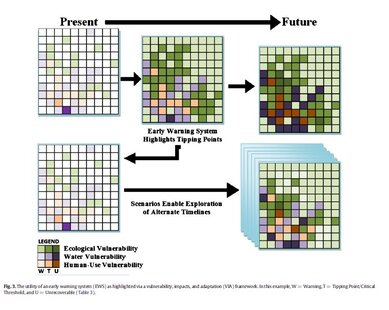 To illustrate where I started, here is an example from a review paper I published in 2014. In this example, I created it myself and didn’t discuss and iterate ideas on with the larger team. It's 'okay'. By the time 2016 rolled along, I was following my now standard approach of working with groups to iterate ideas. These two images were published in a synthesis paper in the journal BioScience and hopefully they illustrate the general idea of what's possible in yes, something like "PowerPoint'. Clearly Google slides could also work.
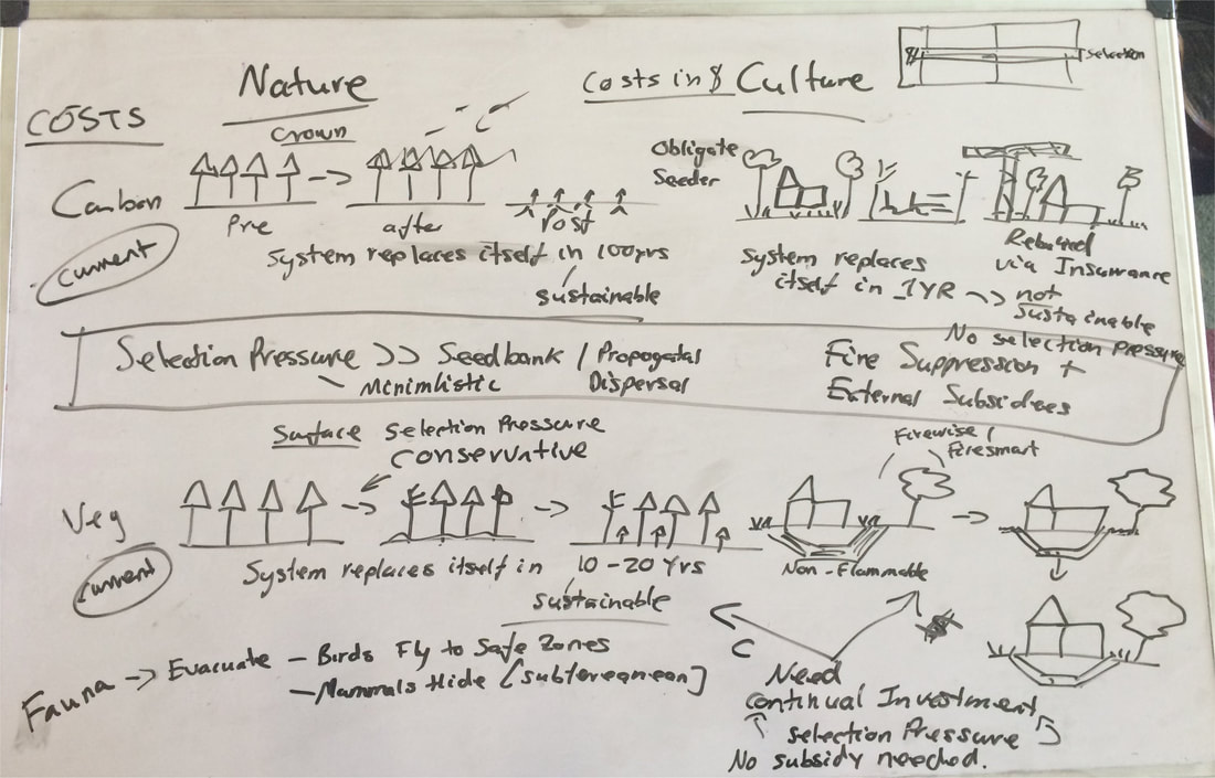
Timeline FiguresSeveral years ago, I was working with a group conducting a review of smoke management and air quality policies. They had created this timeline figure on USA policy developments. 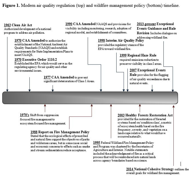 There was nothing structurally wrong with the figure, but I had some ideas to potentially improve it. I started by just creating a template and adding in the same information. I then shared it with the team, got input on more things that could be added, and kept iterating. In the end I created two separate timeline figures for that paper one for the USA and one for Australia that are shown here. 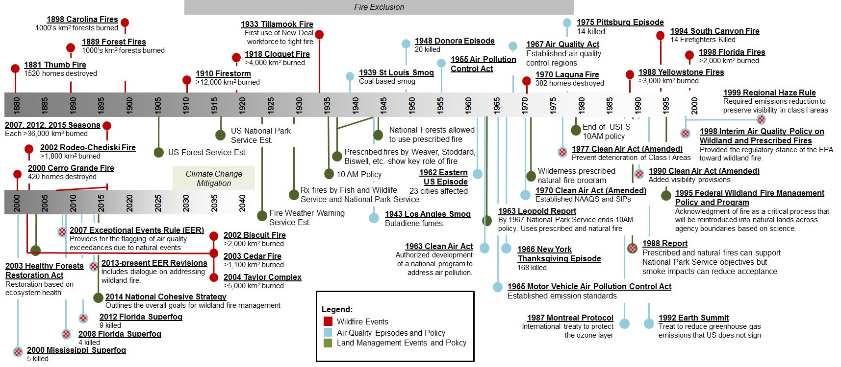 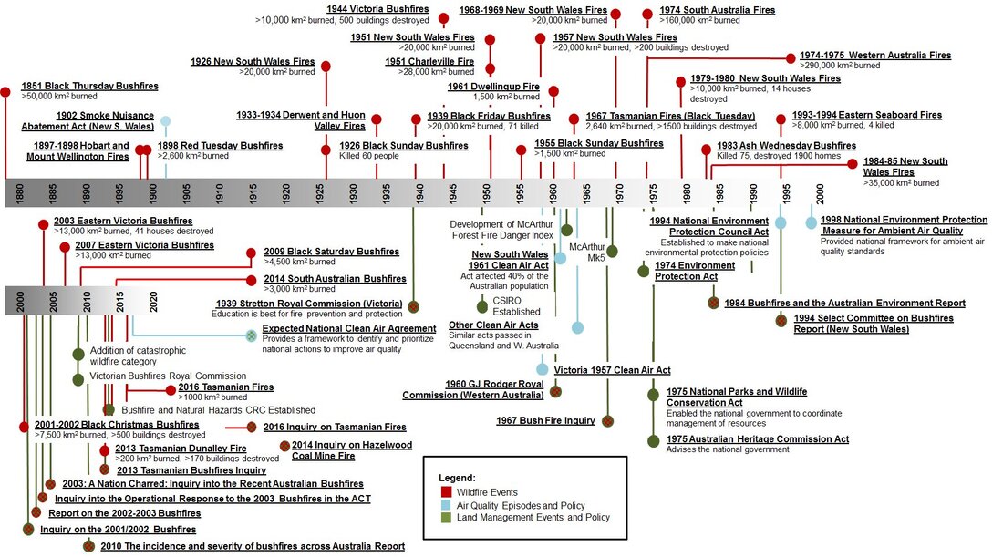 I also shared this template, and helped create another timeline figure for a different paper. 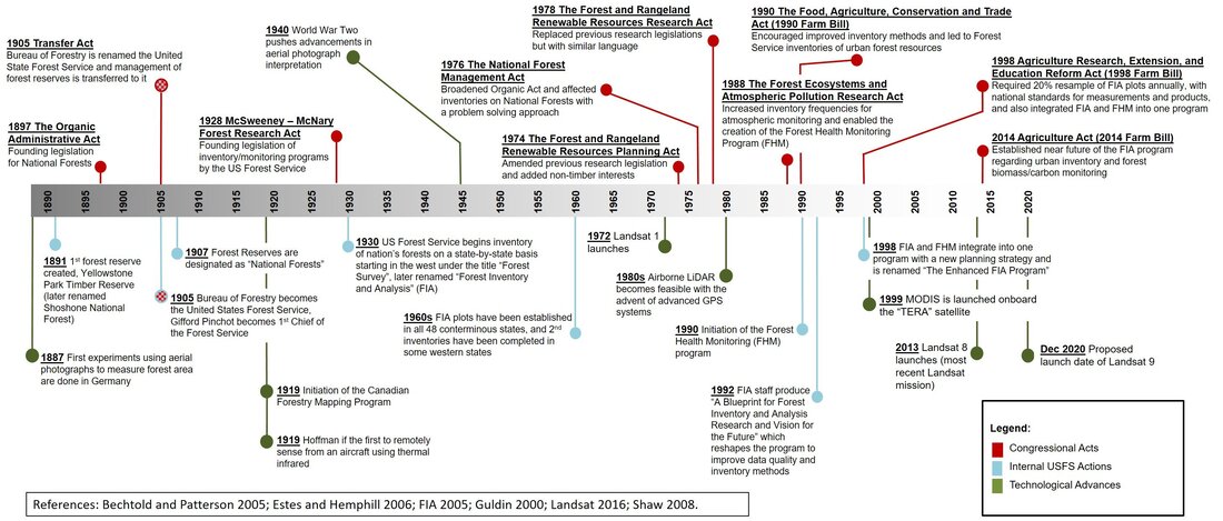 IconsSeveral years back when helping write a paper, I came across icons as a way to help describe concepts. In this example, most of icons were created using geometric shapes. Some of the icons were royalty free icons. There are a lot of royalty free icons out there, just search for icons in your web browser under images. 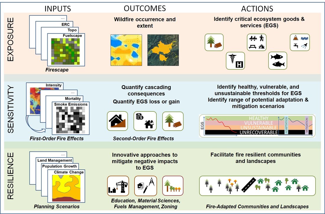 I recently helped create a conceptual figure where I had to create some icons to represent trees and fuel beds. The foliage in the trees shown here were created by using ‘cloud’ templates in PowerPoint and coloring them green and then just connecting them with lines. The bole of the tree was just a brown colored tapered cylinder. To create the fuel beds, I just created lines of varying colors and then copied and pasted them on top of each other to get the ‘fuel’ effect. The roots and trees stumps were just drawn in with the free-form drawing tool. The image shown here was the final version I sent to the lead authors who made some of their own edits before the figure was published. 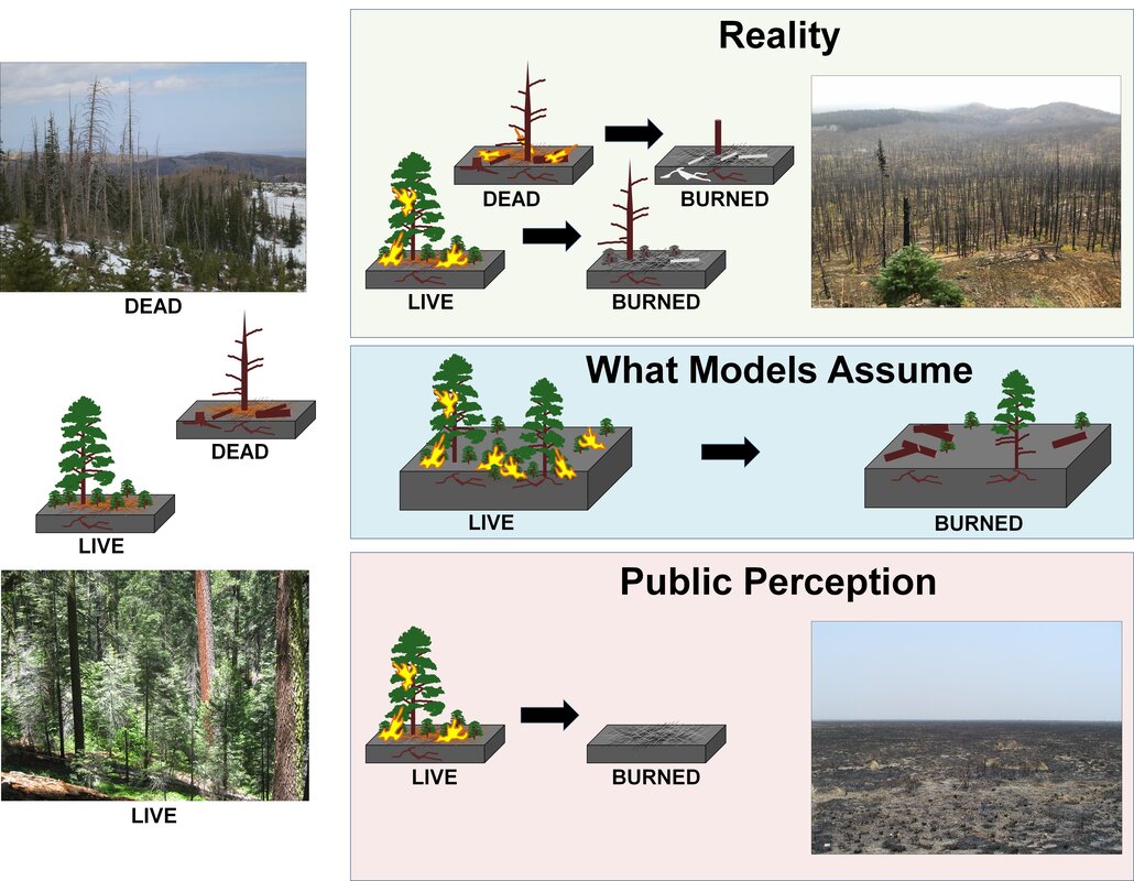  In this example, I created these conceptual figures that were then reimagined by the journal's own artists in the final published paper. They retained all my concepts and I did prefer their version as my 'cows' and 'deer' were not great. These are the images I created based off the whiteboard shown earlier. For my versions, I created all the icons. To create flames, I simply drew a large flame shape, colored it yellow with a red outline, and then copied and pasted it multiple times. The copied versions are then stretched, rotated, and slimmed to make them appear different. Again, the trees (green and burnt) are created using cloud templates or for the conifer just a free-form drawn shape. The firetruck, houses, and cityscape in the lower image were just geometric shapes arranged together. 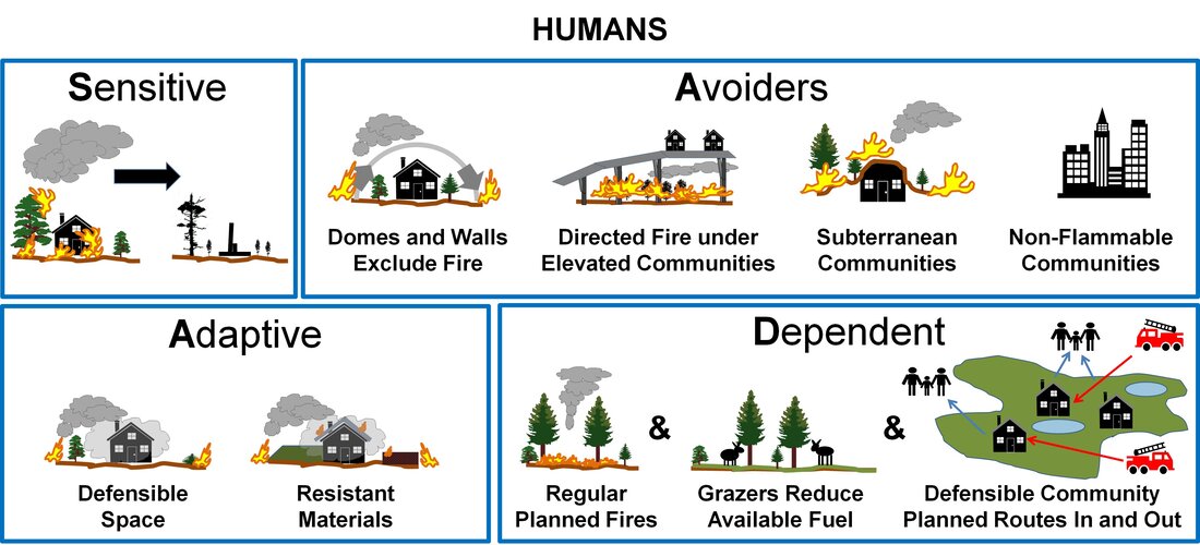 Methodology Figures The best example of this type of figure, which I often use as the basis for future methodology process figures was published in 2017 in a paper led by David Bowman. It was created by using the flowchart shapes in PowerPoint with some basic coloring and blending. It originally was created as an appendix figure but ended up in the main article. It is a great example of how simple often works. 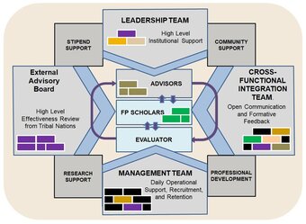 Over the years I have also helped various teams secure funding and creating various conceptual and methodology figures has often been one of my responsibilities. This is a simple example that shows how different groups in a proposal will interact. This is from a NSF proposal that was funded in 2019. In closing, I really like creating conceptual figures and have many more that I'm working on for current submissions.
1 Comment
Having just seen a blog put together by a colleague I greatly respect outlining his thoughts and discoveries over the last 13 years, I felt this was a good as time as any to start one. Where to begin talking about pyroecophysiology? Although I have been working in fire science for over 20 years, let's start in 2016. This is when I pitched an idea in a comment paper where I outlined how we could conduct fire severity research differently. To provide some content. At the time, most fire severity studies would present observations of how fires affected some post-fire measure such as canopy cover, plant mortality, or soil impacts. They would often visit a fire after it occurred and often had never seen the site pre-fire. They would then use their best judgement to estimate how the fire had impacted the vegetation or soil at the site. They sometimes would use remote sensing imagery to also describe the effects of the fire. This imagery may have been collected between a week to a year after the fire. The temporal disconnects and unknowns always bothered me. There was a old phrase that always came to mind from the tv show "The West Wing". Namely, "post hoc ergo propter hoc" or 'after this, therefore because of this'. In ecology, this is often referred to as 'correlation, does not imply causation.' This phrase came to mind because there is often no pre-fire knowledge of the system, so all the effects that are assumed to be caused by the fire could be caused by a number of unknown factors that occurred before the fire. Likewise the temporal disconnect between the fire event and when the post-fire measures are collected was also a concern as many more factors could also interact to cause the observed effects. As I had written in an earlier paper in 2010, even if we can tease out that the fire caused the effect, the magnitude associated with just the fire remains unknown. This led me to pitch the ideas in the 2016 paper. Namely, could we explore the effects of fire on vegetation much like how scientists assess how pharmaceuticals impact living organisms: i.e. conduct 'dose-response' experiments. The idea was that known and repeatable quantities of heat from fires incident on plants would be the 'doses' and associated changes in physiology and morphology metrics or probability of mortality would be the 'responses'. Part of the idea was when fires impact humans, we know human's experience 1st, 2nd and 3rd degree burns and take longer to recover based on the degree of the burn. So why would this not be also true for fire impacting plants? We realized that we needed to explore this idea via controlled experiments. For the first experimental study, we grew saplings of both Larix occidentalis (western larch) and Pinus contorta (lodgepole pine). We had 28 of each and created 4 treatments. i.e. 7 of each species that we didn't burn. and 7 of each species that we burned at 3 different levels of heat incident from the fire. The measure of heat we settled on was fire radiative energy as we could reproduce the specific amount of heat released from known amounts of fuel that had a specific moisture content. Through this we had treatments of known heat, replicates of saplings, and unburned controls: the three essential elements of what we then described as pyroecophysiology research. What we found is that like fire impacting humans, increasing amounts of heat from fire on the tree species did lead to greater degrees of effects. Increasing the dose of heat incident on the saplings led to increased probability of mortality and in those that survived, the time to recovery and the magnitude of the post-fire impacts on future growth was increased with the greater doses of heat. The field of pyroecophysiology was born. 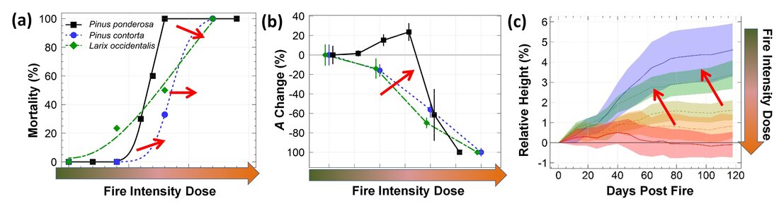 Over the next 5 years we have continued to grow and burn more species to see if we can start understanding if and how these observations change in a wide variety of species that may have evolved better (or worse) to handle fires. We have also undertaken multiple studies looking at interactions between 'doses' of water stress (as a proxy for drought stress) and fire doses.
The term 'pyroecophysiology' has been picked up by others including a nice commentary by Daniel Johnson and Matt Jolly and the number of articles in this new field that connects heat transfer, fire ecology, and plant physiology have started to multiply. It is exciting time to see the start of something and I look forward to seeing how the field evolves as more research groups pursue pyroecophysiology research. For more reading of our works to date, check out the publication tab or follow these links: Smith et al. 2016 - The dose-response severity concept paper Sparks et al. 2016 - Study looking at long term impacts and monitoring with spectral indices Smith et al. 2017 - Results of dose-response experiments on Pinus contorta and Larix occidentalis Sparks et al. 2017 - Results of field-based dose-response experiments on mature Pinus ponderosa trees Sparks et al. 2018a - Impacts of fire and drought on Larix occidentalis Sparks et al. 2018b - Assessing dose-response relationships at landscape scales Smith et al. 2018 - Ideas paper presenting general model of flora, fauna, human responses to fire Steady et al. 2019 - Results of dose-response experiments on Pinus ponderosa Partelli-Feltrin et al. 2020 - Impacts of fire and drought on Pinus ponderosa Partelli-Feltrin et al. 2021 - Short and long term study on Pinus ponderosa with insights on mortality mechanisms Partelli-Feltrin et al. 2022 - Evaluated phloem dysfunction as a driver of fire-induced Pinus ponderosa mortality Wilson et al. 2022 - Impacts of fire intensity of Pinus palustris |
 RSS Feed