|
Recently I was asked on twitter about how I develop conceptual figures, so thought this may be a good topic to cover with a few examples. I create figures in PowerPoint as it is simple to use. Yes, I know there are more fancy tools out there, but most people have access to PowerPoint. To me that is a big plus as often I want to share concepts and get feedback. Also, when working with others who are leading papers or proposals, sometimes they want to make their own adjustments before its final.
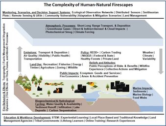
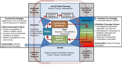
When in PowerPoint, I first make the canvas very large – like a super-giant conference poster. By doing this the font size is between 60-120. You can always shrink it later and this avoids the pixelated look if you need to enlarge it. After that, its just a matter of iterations. When coming up with the concept, its really important to share ideas with the others you are working with and be willing to take suggestions. Even when I am a coauthor or lead on a proposal I treat this role like the other team members are clients and I need to listen to their input :) It can be very rewarding moving through iterations with a team and it always leads to a better final figure. Once I have a final version, I copy the figure into a image editing software. Any works. I personally have always liked Paint Shop Pro (now owned by Corel). i save it as a very large image and resize as needed. I usually save as .tiff if journals want high resolution images and .jpg for proposals. Early Conceptual Figures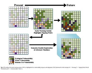 To illustrate where I started, here is an example from a review paper I published in 2014. In this example, I created it myself and didn’t discuss and iterate ideas on with the larger team. It's 'okay'. By the time 2016 rolled along, I was following my now standard approach of working with groups to iterate ideas. These two images were published in a synthesis paper in the journal BioScience and hopefully they illustrate the general idea of what's possible in yes, something like "PowerPoint'. Clearly Google slides could also work.
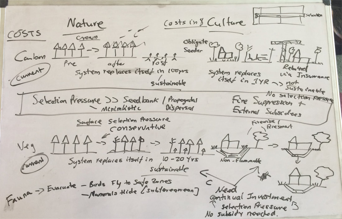
Timeline FiguresSeveral years ago, I was working with a group conducting a review of smoke management and air quality policies. They had created this timeline figure on USA policy developments. 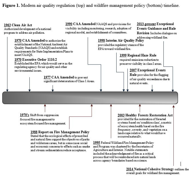 There was nothing structurally wrong with the figure, but I had some ideas to potentially improve it. I started by just creating a template and adding in the same information. I then shared it with the team, got input on more things that could be added, and kept iterating. In the end I created two separate timeline figures for that paper one for the USA and one for Australia that are shown here. 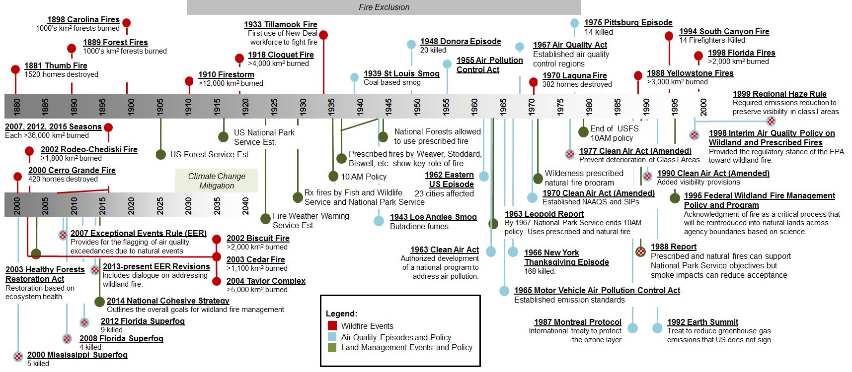 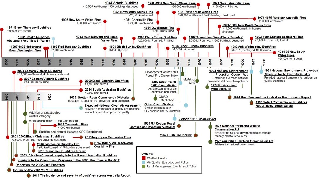 I also shared this template, and helped create another timeline figure for a different paper. 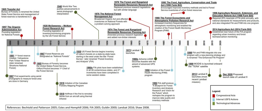 IconsSeveral years back when helping write a paper, I came across icons as a way to help describe concepts. In this example, most of icons were created using geometric shapes. Some of the icons were royalty free icons. There are a lot of royalty free icons out there, just search for icons in your web browser under images. 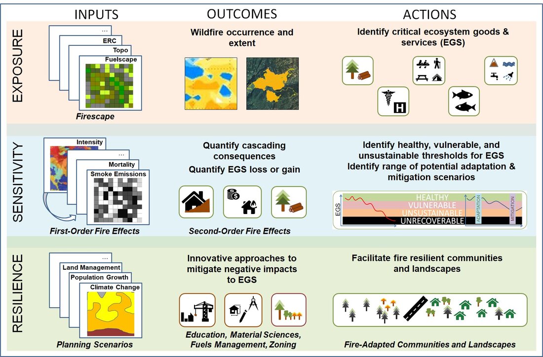 I recently helped create a conceptual figure where I had to create some icons to represent trees and fuel beds. The foliage in the trees shown here were created by using ‘cloud’ templates in PowerPoint and coloring them green and then just connecting them with lines. The bole of the tree was just a brown colored tapered cylinder. To create the fuel beds, I just created lines of varying colors and then copied and pasted them on top of each other to get the ‘fuel’ effect. The roots and trees stumps were just drawn in with the free-form drawing tool. The image shown here was the final version I sent to the lead authors who made some of their own edits before the figure was published. 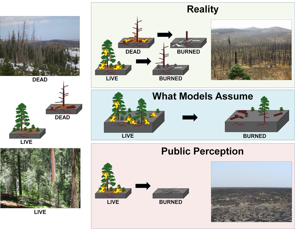 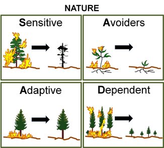 In this example, I created these conceptual figures that were then reimagined by the journal's own artists in the final published paper. They retained all my concepts and I did prefer their version as my 'cows' and 'deer' were not great. These are the images I created based off the whiteboard shown earlier. For my versions, I created all the icons. To create flames, I simply drew a large flame shape, colored it yellow with a red outline, and then copied and pasted it multiple times. The copied versions are then stretched, rotated, and slimmed to make them appear different. Again, the trees (green and burnt) are created using cloud templates or for the conifer just a free-form drawn shape. The firetruck, houses, and cityscape in the lower image were just geometric shapes arranged together. 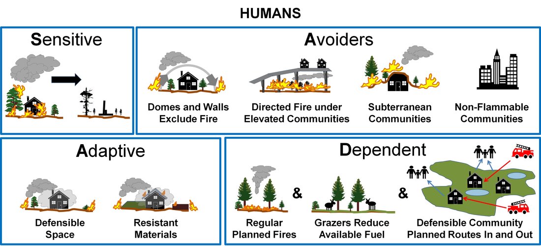 Methodology Figures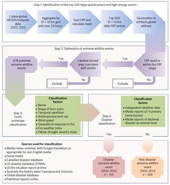 The best example of this type of figure, which I often use as the basis for future methodology process figures was published in 2017 in a paper led by David Bowman. It was created by using the flowchart shapes in PowerPoint with some basic coloring and blending. It originally was created as an appendix figure but ended up in the main article. It is a great example of how simple often works. 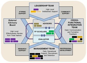 Over the years I have also helped various teams secure funding and creating various conceptual and methodology figures has often been one of my responsibilities. This is a simple example that shows how different groups in a proposal will interact. This is from a NSF proposal that was funded in 2019. In closing, I really like creating conceptual figures and have many more that I'm working on for current submissions.
1 Comment
Mark
6/1/2021 07:58:36 am
Timely blog Alistair. Mocking up a conceptual figure for an AFRI grant and your insights are very helpful! Thanks for posting. Leave a Reply. |
 RSS Feed